Question
How do I choose what type of chart to use in Excel?
Answer
Different charts emphasize different data.
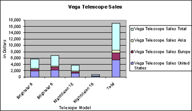
- For example, a stacked column chart (see below) compares the contributions to a total that consists of different values, showing either units or percentages.

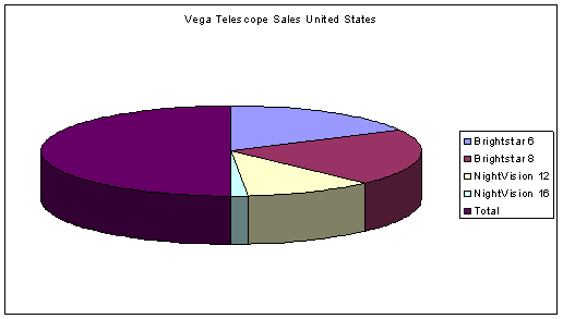
- A Pie chart is designed to show comparisons within a single set of values, and to show how parts contribute to a whole.

- A Line chart (see below) is the best way to show trends and changes over time. Use a Line chart if you want dates on the bottom of the chart, to make historical developments visible at a glance. Line charts usually have only one set of numbers, shown on the vertical axis.

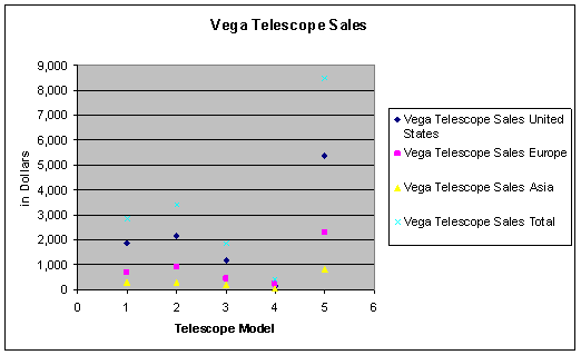
- An XY Scatter chart compares two sets of numbers at once, one on the horizontal X axis, one on the vertical Y axis. The data values are scattered across the chart. You have the option of connecting the values with lines, but those lines don't show trends over time.
XY Scatter charts are good for showing comparisons of numbers such as scientific or statistical data, where several measurements need to be plotted on a single chart. If you wanted to show how many cases of flu occurred in various age groups, or the average incomes in cities of various sizes, an XY Scatter chart would be an effective type.

For more information about Charts and Graphs in Excel, please view the full tutorial from the CTL here: Excel Part 2
If you need further assistance, please click the CTL Support Request button on this page.